


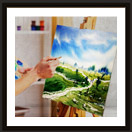


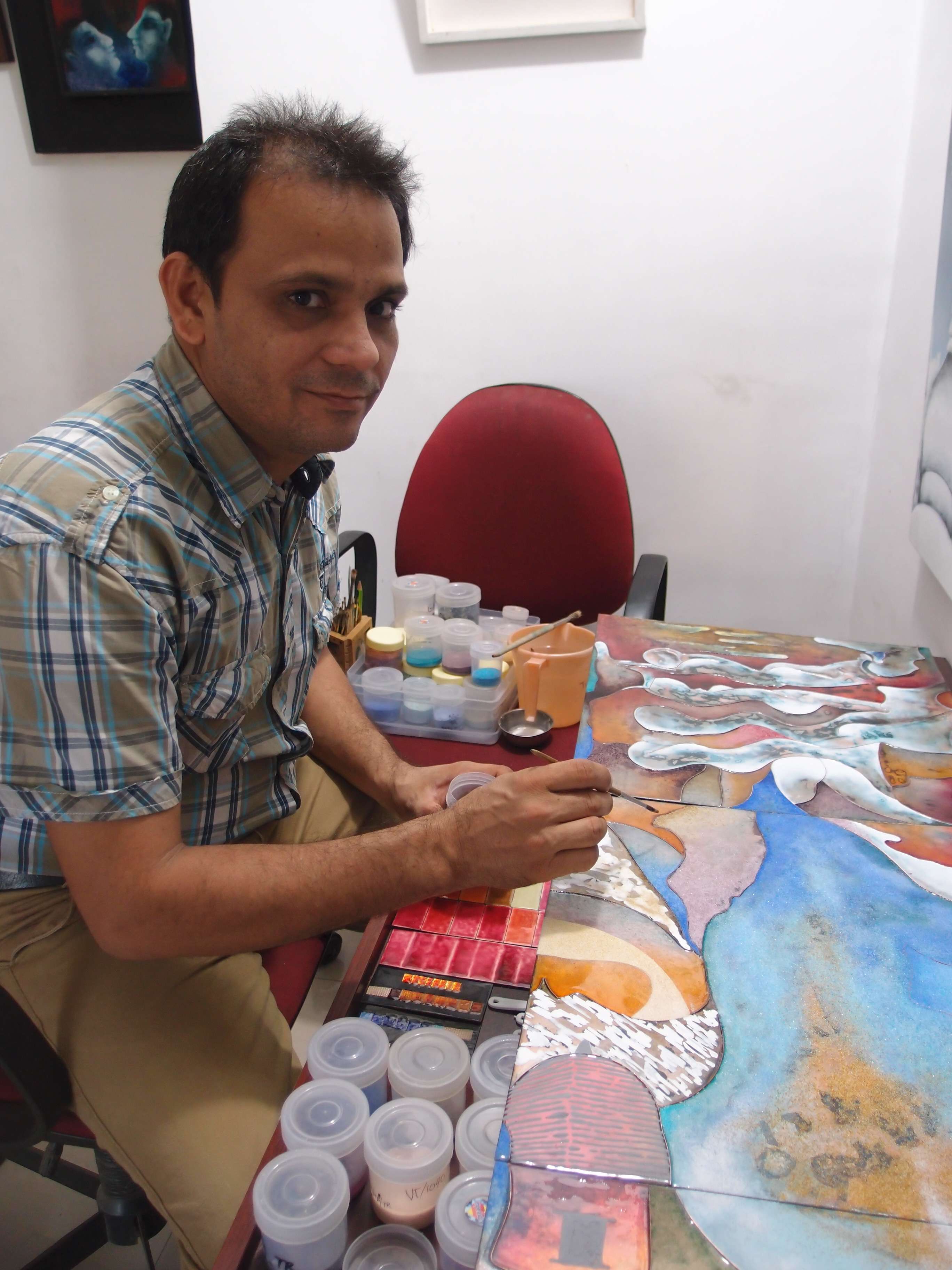


Indulging in landscape art often puts you in a situation where your paintings end up looking flat and missing the spark. However, with the use of the right combination of techniques, you can instantly transform your landscape paintings into compositions with elements of realism and a strong sense of distance.
We have compiled the essentials tips to help you create a sense of depth in your nature paintings correctly.
-
Use Tones To Create Distance
If your landscape art seems flat, with the scene carrying no sense of distance, carefully examine the tone or value in your painting. The next task at hand that you should undertake is to employ a lighter tone on everything that’s in the distance of a landscape painting. Doing so will immediately give a sense of depth.
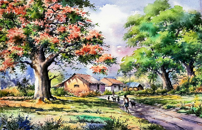
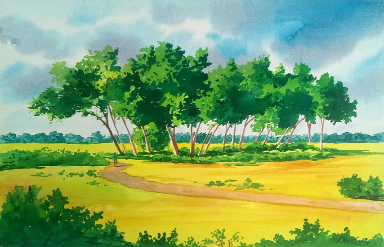
Using tone to create a sense of distance in art is known as Aerial Perspective, which often scares many artists. However, there is nothing to be worried about, it is a simple observation that you surely would have explored not just painting but also while admiring landscapes on your vacation (perhaps not familiar with its technical jargon). For example, when you see a scenery with a series of mountains or hills, paying a little attention will help you notice how with the distance they get lighter and lighter, the further away they are. This is what aerial perspective is all about, or a gradual change in tone that adds a sense of distance.
The next step in further manifesting aerial perspective is getting in terms with the facts that things that are located farther away are bluer. So, while lightening the tone of the objects in the distance, you also need to make the colors a little bluer or colder. For instance, while choosing greens for your landscape paintings, make sure to use in the foreground the hues that leans towards yellow while for a mountain positioned farther away, go for those that lean towards blue.
Here’s a basic 'recipe' that some seasoned artists recommend while applying aerial perspective:
- Keep the Foreground Normal
- The Middle Distance should be a little lighter in Tone and Bluer
- Those in the Far Distance must be painted much lighter and Bluer
- Remember objects in red appear to be closer, so if you find the perspective in your landscape painting looking flat, do not put a red object (for instance a girl wearing a red dress) in the distance but always place in the foreground, and try adding something in light blue to the distance.
-
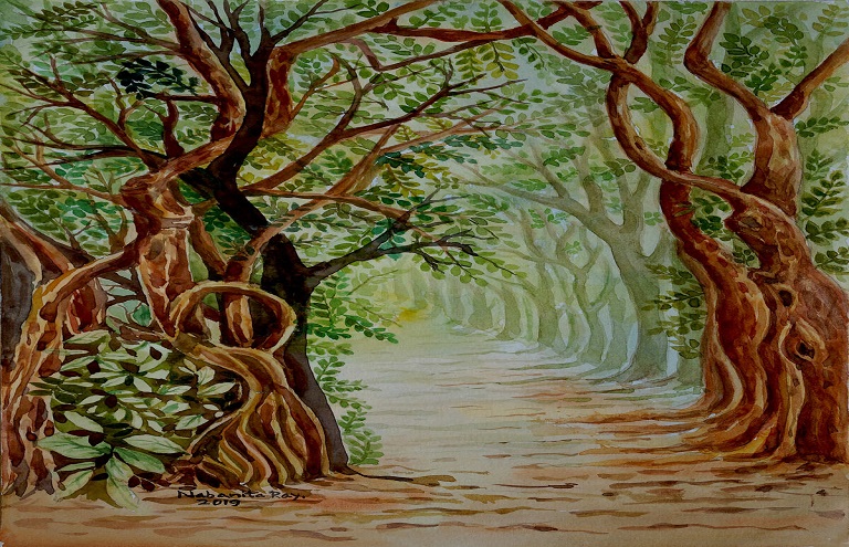
Decrease the Detail in Landscape Paintings
If examined carefully, you would notice that the details of objects (such as trees, plants, etc.) that are closest are more clearly visible. So while capturing any scene, follow the same concept, and add more details in the foreground and less in the middle distance, while only suggest it for the elements existing in the background. However, make sure to give only a sense of texture, tone, and color for manifesting the distance and not working on the specifics.
Quite often while working from a reference photograph, artists get swayed by the extra details visible on the picture taken from ultra-high resolution cameras, such as every minute blade of grass located several kilometers away. In such cases, please keep in mind that you are painting and not attempting to reproduce the photos.
-
Position of the Horizon Line
Indeed, the horizon line is the foremost and strongest visual element of perspective in a landscape. It is something that you immediately (rather instinctively) use to interpret the perspective of the painting that you are looking at.
So if the horizon line in your nature paintings is either too high or low you are bound to miss on the crucial visual information used by the viewer to perceive the perspective. In fact, you would make the viewer struggle to deal with understanding the placement of the horizon line, its position, and context, and most likely make him/her end up interpreting in relation to everything else placed in the composition. This moment of confusion will certainly be enough to make your landscape feel awkward, and off.
A horizon line placed too high with only a meager sliver above it will go unnoticed by the viewer and won’t be perceived as the sky while a one too low, with little sliver below, will have a risk of not being registered as land. Having said this does not mean that you need to rigidly apply the Rule of Thirds or Golden Mean for calculating the right placement of the horizon line, but rather you need to be careful about having enough above as well as below the horizon line for the viewer to perceive immediately.
-
Work on The Road Illusion
One of the easiest and often the most effective way to create the illusion of distance any artwork is to incorporate an element of a familiar size that gets smaller as it goes farther away into the distance in adherence to the rules of perspective, such as a railway, a bridge, maybe a road. You must have noted that ideally, the road seems to be of the same width along its entire length but moving further away into the distance it appears narrower. Doing the same while painting any landscape instantly registers as depth.
Another way to put this aspect into action is to include an element that can quickly give a sense of scale to your landscape composition. Including such a figure will tend to pull the eyes of the viewer strongly, and automatically he/she would scale the rest of the components accordingly.
You can consider adding an animal or diagonals, lines, such as waves that angle away, and then recede, but remember that this doesn't work strongly if you include trees as it is common to find trees even of the same species in a wide range of sizes. You can add humans too, but as humans tend to instinctively to quickly figure if that person is an adult or child from their size, posture, and maybe clothing.
Even while working on this technique, remember to decrease the level of detail that you add towards the background. For example, every leaf on a tree placed in the foreground of a scene is clearly visible, but it will not be when placed very far away.
-
Choose Canvas Format Wisely
Before you start working on your landscape composition, take time to carefully choose if you wish to go for landscape or portrait one or a simple square canvas. Avoid picking up the format that first comes to hand as it significantly affects the overall effect of the landscape art. Know that illusion of depth or distance is easier to be perceived in a painting with a wide landscape format rather than one having a narrow portrait format. Undoubtedly, the width of the canvas allows for more elements of perspective to seamlessly tie into the composition’s horizon line.
Also, as the human eyes are trained to look at landscape sideways, viewers automatically tend to see the composition horizontally and not vertically. That said, scenes of cityscapes or inside something such as a forest work well in portrait orientation which is viewed down as tunnels of high-rise buildings or trees.
-
Don’t Forget The Edges
While creating the landscapes, don't end up neglecting hard and soft edges. A soft edge usually seems further away, more like a lost element you can't quite see it. However, a sharply defined edge will seem closer and clear. So, make sure that you layer the arrangement of different elements in different layers placed one behind another keeping the parts concealed. Simply, create the sense of the scene marching away into the distance.
Read More: How to Make a Landscape Painting?
Wrap Up
Though these tips will help you to create more life and add depth in your landscape paintings, don’t restrict yourself to following them rigidly. Instead, use them as a guide and don’t hesitate to add something of your own in the work. Seek the humor, a bit of quirk, add elements that no one else can see in your own way and you will end up creating a striking piece full of personality.
Quick Tips
- The technique of aerial perspective applies to the sky as well as land. So, remember that the sky directly above should be bluer than on the horizon. You can even rely on a digital photograph (initially) to help you provide information on sky color.
- Remember that warm objects always appear closer, so if in case your landscape paintings seem to be devoid of depth, don’t try to resolve it by adding a smaller figure wearing red clothing in the distance, instead have them draped in blues.
- With the horizon line being one of the most powerful visual signs for defining the viewpoint as well as perspective in landscape composition, spend time exploring its right placement. Too high will leave little space for your sky and too low down will give you hardly any room to put in the elements of the foreground.
- While viewing objects from increasing distances, you would find the color change effect to be more prominent (moving progressively from the purple to blues). So, remember to keep the color temperature right with warm in the foreground, cools in the background.